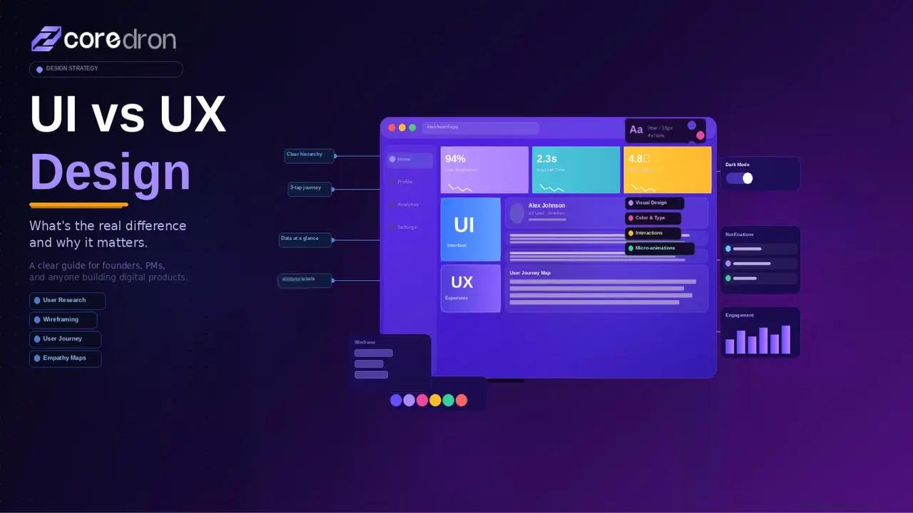
Introduction
UI and UX get grouped together so often that the distinction starts to blur.
In product conversations, the terms are used loosely. A confusing checkout flow gets labeled a “UI issue.” A redesign is expected to fix deeper engagement problems. The language overlaps, responsibilities don’t.
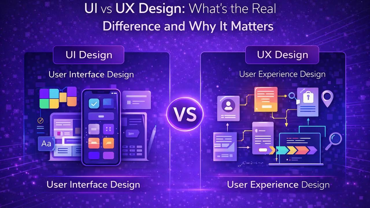
UI design focuses on the elements users interact with directly, such as layout, typography, spacing, visual hierarchy, and interactive states. It shapes the surface.
UX design works at a different layer. It looks at structure:
- How users move through the product
- How decisions are presented
- How friction appears or disappears across the journey.
When the two are treated as interchangeable, products suffer in subtle ways.
A refined interface won’t fix a broken flow, and a well-planned experience loses impact if the interface feels inconsistent.
Understanding where UI ends and UX begins changes how products are designed and how problems are solved.
What UX Design Actually Covers
UX design begins before screens are designed; it starts with questions about behavior.
- Who is using the product?
- What are they trying to complete?
- Where do they hesitate?
- What information do they need before taking action?
UX is concerned with structure. It defines how content is organized, how navigation works, and how users move from one state to another without confusion. It also considers context.
A first-time visitor behaves differently from a returning user. Someone on mobile moves differently from someone on a desktop. UX design accounts for these differences in flow, not just in layout.
Wireframes, user journeys, information architecture, interaction logic… these are UX decisions. They shape how the product functions beneath the interface.
When UX is strong, users don’t need instructions; the path feels obvious. When UX is weak, users compensate. They reread labels. They backtrack. They abandon.
UX design is less about how something looks. It’s about whether the product makes sense.
What UI Design Actually Shapes
If UX defines the structure, UI defines how that structure is experienced visually and interactively. It operates at the execution layer.
1. Visual Hierarchy
UI determines what users notice first:
- Font weight
- Spacing
- Contrast
- Button prominence
- Alignment.
These choices influence attention, a primary action that blends into the background creates hesitation. Clear hierarchy reduces cognitive effort.
Good UI isn’t for decoration; it guides users to take actions.
2. Interactive States
A product isn’t static - Buttons hover, fields validate, dropdowns expand, and error messages appear.
UI design shapes these transitions. It determines whether feedback feels immediate or delayed, reassuring or confusing.
Micro-interactions matter here; they communicate system behavior without explanation.
3. Consistency Across Screens
Consistency isn’t an aesthetic preference. It builds familiarity.
When patterns repeat navigation placement, button styling, and spacing rules, users build mental shortcuts. They stop thinking about mechanics and focus on tasks.
Inconsistent UI forces re-learning.
4. Emotional Tone
Color systems, typography choices, motion, and spacing all influence perception.
A fintech dashboard feels different from a gaming app. A healthcare platform shouldn’t resemble a social feed.
UI shapes tone, tone shapes trust. UI design is not “just visuals.”
It translates structure into clarity. When done well, users don’t consciously notice it, but they benefit from it in every interaction.
Where UI and UX Overlap And Where They Don’t
UI and UX aren’t competing disciplines. They operate on different layers of the same system. The confusion happens because they influence each other constantly.
Where They Intersect
Both focus on user interaction.
UX defines the flow - what happens first, what comes next, where decisions are made. UI determines how those steps appear and respond visually.
For example, UX may decide that checkout should happen in three steps instead of five. UI decides how those three steps are presented: spacing, buttons, progress indicators, and feedback states.
One shapes logic, the other shapes the presentation. They meet at execution.
Where They Separate
UX deals with structure before visuals exist.
Information architecture, journey mapping, usability testing, and user research are UX responsibilities.
They answer: Does this process make sense?
UI begins once the structure is defined.
It answers: Does this interface make the process clear?
A product can have:
Strong UX, but weak UI → The flow works, but the interface feels confusing or inconsistent.
Strong UI, but weak UX → The screens look polished, yet the workflow feels frustrating.
They fail in different ways. Understanding that separation changes how design problems are diagnosed.
- If users drop off mid-process, the issue may be structural (UX).
- If users hesitate on a screen, the issue may be visual clarity (UI).
Treating them as interchangeable often leads to solving the wrong problem.
UI vs UX - Failure Pattern Recognition
Still confused about the difference between UI and UX? Here’s a closer look at pattern recognition.
| Product Scenario | Likely UX Issue | Likely UI Issue |
| Users leave midway through different steps | Long flow, unclear steps that create friction | Buttons or next actions aren’t clearly visible |
| Users hesitate before the next step | Information hierarchy does not support decision-making | CTA lacks action or clarity |
| High bounce rate for the landing screen | User intent mismatch or low value proposition | Overwhelming visual clutter or layout |
| Frequent ticket support | Confusing task structure or navigation logic | Unclear labels, icons, or affordances |
| Increasing user reports | Workflow requires unnecessary effort | Interface feels inconsistent |
| Lower feature usage | The feature placement or discovery path is weak | Interactive cues are not obvious enough |
How the Difference Impacts Business Outcomes
The distinction between UI and UX is not theoretical. It affects measurable product performance.
1. Conversion Rates
If users understand what to do but don’t see where to click, the issue is often UI. If users see the button but don’t understand why they should continue, the issue is likely UX.
Conversion drops for different reasons depending on which layer fails. Improving visuals won’t fix structural friction. Reworking the flow won’t help if actions lack clarity.
2. Retention and Engagement
Users return to products that feel intuitive. A well-structured experience helps in the following:
- Reduces cognitive effort
- Tasks feel predictable
- Navigation feels natural.
UI reinforces that comfort through consistency and feedback.
- When UX is weak, users abandon because processes feel confusing.
- When UI is weak, users hesitate because the interface feels unreliable.
Both influence long-term retention in different ways.
3. Development Efficiency
Misdiagnosing UI problems as UX or vice versa wastes time. Teams redesign screens when the real issue is flow.
Or they restructure processes when the issue is visual hierarchy. Separating the two disciplines allows teams to address the right layer first.
4. Brand Perception
UX shapes how usable a product feels. UI shapes how polished it appears.
A product may look refined but feel frustrating, or function logically yet appear outdated. Perception is formed by both, but they influence it through different mechanisms.
Understanding where UI ends and UX begins changes how design problems are approached. It also determines whether improvements are cosmetic or structural.
How UI and UX Should Work Together in Product Teams
UI and UX shouldn’t operate like a relay race, where one handoff to the other. They overlap in practice, even if they focus on different layers.
- Structure Comes First
Before colors, typography, or component systems are discussed, someone has to define how the product works.
- What is the first action?
- Where does the user land?
- What happens if they abandon halfway?
Those decisions sit in UX. If the structure is unclear, visual refinement won’t fix it. It only makes confusion look better.
- Interface Reinforces Intent
Once the flow exists, UI carries responsibility.
- If a step is critical, it must stand out.
- If feedback is required, it must be visible.
- If navigation repeats across screens, it must feel consistent.
UI doesn’t invent the journey. It makes the journey usable.
- Problems Must Be Diagnosed at the Right Layer
When users struggle, teams often jump straight into redesign. Sometimes the issue is structural: too many steps, unclear decision logic.
Other times, the structure works, but hierarchy or affordances are weak.
Fixing the wrong layer wastes cycles.
- Strong teams ask first:
- Is this a flow problem?
- Or a clarity problem?
The answer determines whether UX or UI needs attention. UI and UX don’t compete.
They solve different parts of the same problem. When they align, the product feels deliberate rather than patched together.
Conclusion
UI and UX design solve different problems, even though they operate inside the same product.
- UX defines how the system works; it shapes: Structure, flow, and decision paths. If that layer is weak, users feel friction before they can even articulate why.
- UI defines how the system communicates; it determines whether actions are clear, feedback is visible, and hierarchy guides attention.
Confusing the two often leads to surface-level fixes. Teams redesign screens when the issue sits in flow logic. Or they restructure processes when the real problem is visual clarity.
Strong products treat UI and UX as coordinated disciplines. One builds the foundation. The other makes it usable.
When both align, users move naturally through the product without thinking about the design.
FAQs
Q. Is UI the same as UX design?
No. UX focuses on structure and flow, while UI handles visual and interactive execution within that structure.
Q. Can a product have good UI but poor UX?
Yes. An interface can look refined while the workflow feels confusing or unnecessarily complex.
Q. Which one affects conversion more - UI or UX?
Both can. UX influences whether users understand the process. UI affects how clearly actions are presented.
Q. Should startups focus on UX before UI?
Early products benefit from a strong UX structure first. Visual refinement becomes more impactful once the flow is stable.
Q. Do UI and UX require different skill sets?
Often, yes. UX leans toward research and structure. UI emphasizes visual hierarchy, interaction design, and consistency.
Q. How do teams know whether a problem is UI or UX?
By observing behavior. If users struggle with steps, it’s likely UX. If they hesitate visually, it’s often UI clarity.